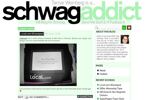
Schwag Addict Gets a Redesign 15th July, 2008
Hey guys — it’s been quiet here since we’ve been working on an awesome redesign from the guys at web development firm We Do Creative. The blog sports 125×125 advertising spots (not yet activated) among many other cool design enhancements, as you can see.
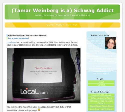
This is what the old site looked like:
As you can tell, this new design is cleaner and much cooler! 🙂
Of course, I’d love to hear how you like it (or don’t like it). What do you think?
July 15th, 2008 at 9:02 pm
Tamar – Lovin’ the new design! Hope all is good with you … Charlie
July 15th, 2008 at 10:30 pm
the design looks very good. The only thing you want to consider is the logo is too big. 1222px so anyone who is running 1024 screen alot of people will have to scroll horizontally.
July 15th, 2008 at 10:32 pm
Thanks Syed. Noted. That’s actually something I’m considering keeping since people should be upgrading their resolutions anyway. Not to discriminate, but the future is now 😉
July 16th, 2008 at 12:39 am
I like it too and it just screams your a bigger schwag addict than before. Keep showin’ us the schwag.
July 17th, 2008 at 11:06 am
Tamar – Hey this is Ty Downing, I sent you the Google Pen Schwag awhile back, I love the site, doesn’t look like a typical blog anymore, it expresses the real you! I may be having some “Green Eco” schwag for ya soon!
July 21st, 2008 at 1:56 am
I’m all about that, Ty! Thanks! 🙂